机器学习之梯度下降法
摘要拿 20 个点做一次线性拟合,记录损失函数、学习率以及 JS 和 PyTorch 两份实现。
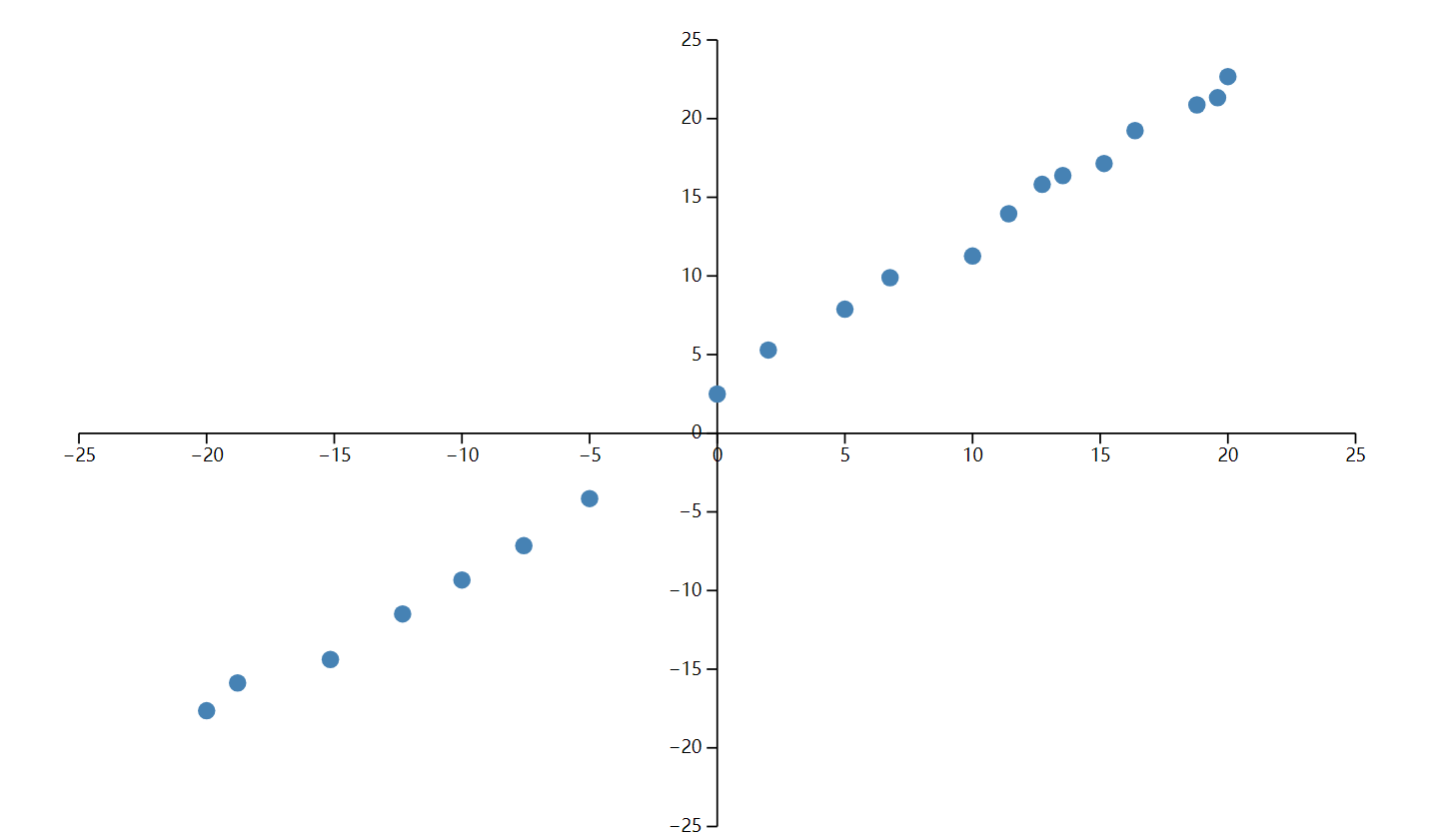
从 20 个点开始
这次不从神经网络讲起,先做一个足够小的题目:给出 20 个点,用一条直线把它们拟合出来。
const data = [
{ x: -20.000, y: -17.641 },
{ x: -15.152, y: -14.381 },
{ x: -10.000, y: -9.327 },
{ x: -5.000, y: -4.154 },
{ x: 0.000, y: 2.493 },
{ x: 5.000, y: 7.882 },
{ x: 10.000, y: 11.264 },
{ x: 12.727, y: 15.819 },
{ x: 15.152, y: 17.147 },
{ x: 18.787, y: 20.874 },
{ x: 20.000, y: 22.672 },
{ x: -18.787, y: -15.874 },
{ x: -12.323, y: -11.486 },
{ x: -7.576, y: -7.148 },
{ x: 2.000, y: 5.293 },
{ x: 6.768, y: 9.888 },
{ x: 11.414, y: 13.952 },
{ x: 13.535, y: 16.384 },
{ x: 16.364, y: 19.241 },
{ x: 19.596, y: 21.328 }
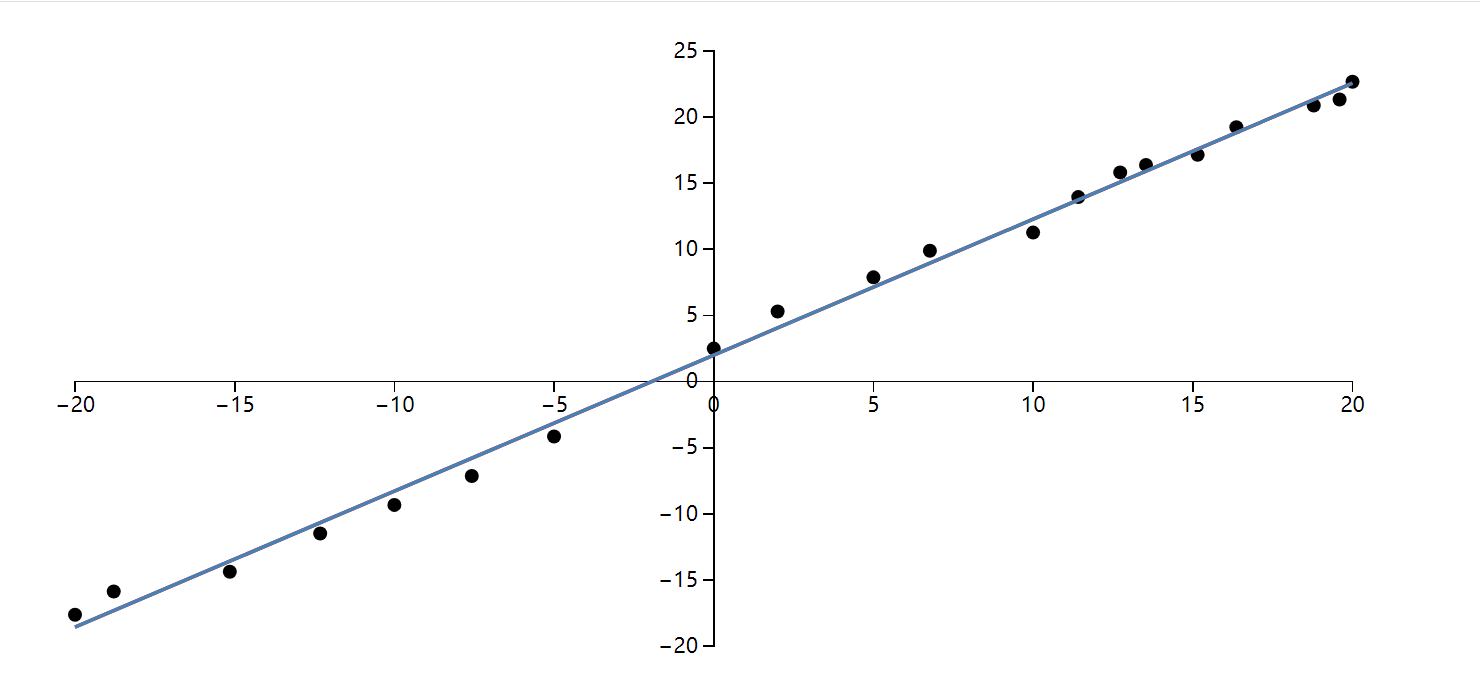
];把点交给 D3 画出来,趋势已经很明显,大致就是 y = x + 2:
要让程序自己找到这条线,先把它写成 y = ax + b,再决定怎样评价一组 a、b。我这里直接计算预测值与真实值的平方误差,并把 20 个点的误差汇总起来:
这就是这次采用的损失函数。平方以后不用分别处理正负误差,偏得越远,付出的代价也越大。于是拟合问题变成了一个更具体的问题:找出让损失最小的 a 和 b。
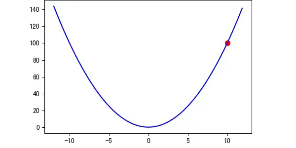
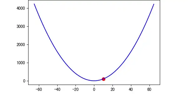
对这组数据来说,损失关于 a、b 是一个凸的二次函数,当然可以直接解方程。这里故意不用闭式解,因为我更想把梯度下降每一步是怎么走的看清楚。
梯度下降法
最直白的办法是枚举:给参数加一点、减一点,比较哪边的损失更小。一个参数还能凑合,参数一多,搜索空间很快就不可用了。
导数正好给出了当前位置的变化方向和陡峭程度。每次按 parameter -= learningRate * gradient 更新,离最低点远时通常走得快,接近时步子自然收小:
这里的 learningRate 就是学习率。取小了,方向没问题,但要迭代很久:
取大了则容易跨过最低点,在两侧来回震荡,甚至不收敛:
动画能说明方向,但学习率到底怎样改变训练过程,最好亲手拧一次。下面仍然使用开头那 20 个点:把学习率调到 0.001 左右,线会稳稳贴近数据;继续往右推,它会先震荡,再直接发散。右侧的损失轨迹和参数都是真实逐轮计算,不是预先录好的动画。
动手实验 · 约 30 秒
亲手把直线推到最低点
同一组数据、同一份 MSE;只有学习率由你控制。
建议先保持 0.001,点「连续训练」;再重置并把学习率拖到最右侧。
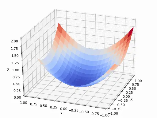
前面的动画只有一个参数,而直线里同时有 a 和 b。处理方式并没有变:固定其中一个参数,对另一个求偏导,分别得到损失在两个方向上的变化率。把这些偏导排在一起就是梯度;梯度指向上升最快的方向,所以更新时要沿它的反方向走。
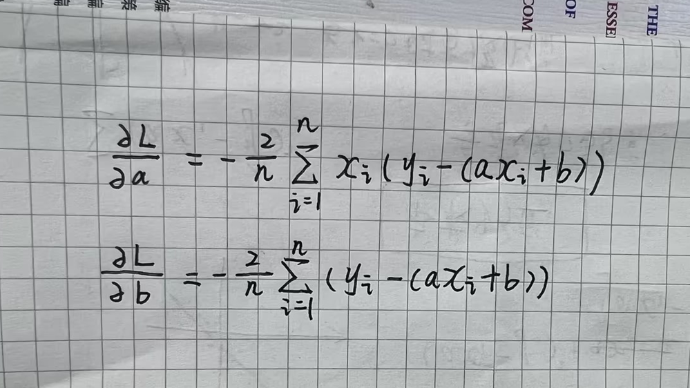
回到刚才的损失函数:

分别对 a 和 b 求偏导:
下面这份代码没有借助机器学习框架。每轮先遍历数据算出两个梯度,再更新 a、b,D3 只负责把最终结果画出来:
<!DOCTYPE html>
<html lang="en">
<head>
  <meta charset="UTF-8">
  <meta name="viewport" content="width=device-width, initial-scale=1.0">
  <title>Linear Regression with D3.js</title>
  <script src="https://d3js.org/d3.v7.min.js"></script>
  <style>
    .axis path,
    .axis line {
      fill: none;
      shape-rendering: crispEdges;
    }
    .axis text {
      font-size: 12px;
    }
  </style>
</head>
<body>

<div id="chart"></div>

<script>
  const data = [
    { x: -20.0, y: -17.641 },
    { x: -15.152, y: -14.381 },
    { x: -10.0, y: -9.327 },
    { x: -5.0, y: -4.154 },
    { x: 0.0, y: 2.493 },
    { x: 5.0, y: 7.882 },
    { x: 10.0, y: 11.264 },
    { x: 12.727, y: 15.819 },
    { x: 15.152, y: 17.147 },
    { x: 18.787, y: 20.874 },
    { x: 20.0, y: 22.672 },
    { x: -18.787, y: -15.874 },
    { x: -12.323, y: -11.486 },
    { x: -7.576, y: -7.148 },
    { x: 2.0, y: 5.293 },
    { x: 6.768, y: 9.888 },
    { x: 11.414, y: 13.952 },
    { x: 13.535, y: 16.384 },
    { x: 16.364, y: 19.241 },
    { x: 19.596, y: 21.328 }
  ];

  // Initialize parameters
  let a = 0;
  let b = 0;
  const learningRate = 0.001;
  const iterations = 10000;
  const n = data.length;

  // Compute gradients
  function computeGradients(a, b) {
    let da = 0;
    let db = 0;

    for (let i = 0; i < n; i++) {
      const x = data[i].x;
      const y = data[i].y;
      const y_pred = a * x + b;

      da += -2 * x * (y - y_pred);
      db += -2 * (y - y_pred);
    }

    da /= n;
    db /= n;

    return { da, db };
  }

  // 每次算出梯度,然后相减
  function gradientDescent() {
    for (let i = 0; i < iterations; i++) {
      const gradients = computeGradients(a, b);

      a -= learningRate * gradients.da;
      b -= learningRate * gradients.db;
    }
  }

  // Run gradient descent
  gradientDescent();

  // D3.js Visualization
  const margin = { top: 20, right: 30, bottom: 40, left: 40 };
  const width = 800 - margin.left - margin.right;
  const height = 400 - margin.top - margin.bottom;

  const svg = d3.select("#chart")
    .append("svg")
    .attr("width", width + margin.left + margin.right)
    .attr("height", height + margin.top + margin.bottom)
    .append("g")
    .attr("transform", `translate(${margin.left},${margin.top})`);

  // Set the scales so that (0,0) is at the center of the chart
  const x = d3.scaleLinear()
    .domain([-20, 20])  // Set the x domain to be symmetrical around 0
    .range([0, width]);

  const y = d3.scaleLinear()
    .domain([-20, 25])  // Set the y domain to accommodate data points
    .range([height, 0]);

  // Draw X and Y axes
  svg.append("g")
    .attr("class", "x axis")
    .attr("transform", `translate(0,${y(0)})`)  // Set y(0) to place X axis at y = 0
    .call(d3.axisBottom(x));

  svg.append("g")
    .attr("class", "y axis")
    .attr("transform", `translate(${x(0)},0)`)  // Set x(0) to place Y axis at x = 0
    .call(d3.axisLeft(y));

  // Draw Data Points
  svg.selectAll(".dot")
    .data(data)
    .enter().append("circle")
    .attr("class", "dot")
    .attr("cx", d => x(d.x))
    .attr("cy", d => y(d.y))
    .attr("r", 4);

  // Draw Regression Line
  const line = d3.line()
    .x(d => x(d.x))
    .y(d => y(a * d.x + b));

  svg.append("path")
    .datum(data)
    .attr("class", "line")
    .attr("fill", "none")
    .attr("stroke", "steelblue")
    .attr("stroke-width", 2)
    .attr("d", line);
</script>

</body>
</html>
这里只有 20 个点,每轮完整遍历一次完全够用。数据量和模型层数上来以后,逐点写循环就不合适了;梯度计算可以改写成矩阵运算,再做批处理或交给 GPU。规模变了,更新参数的逻辑没有变。
这份 JS 实现跑出的结果如下:
为了对照手写梯度和框架自动求导,我又用 PyTorch 写了一遍,数据、学习率和迭代次数保持一致:
import torch
import torch.nn as nn
import numpy as np
import matplotlib.pyplot as plt

# 原始数据点
data = [
    {"x": -20.0, "y": -17.641}, {"x": -15.152, "y": -14.381},
    {"x": -10.0, "y": -9.327}, {"x": -5.0, "y": -4.154},
    {"x": 0.0, "y": 2.493}, {"x": 5.0, "y": 7.882},
    {"x": 10.0, "y": 11.264}, {"x": 12.727, "y": 15.819},
    {"x": 15.152, "y": 17.147}, {"x": 18.787, "y": 20.874},
    {"x": 20.0, "y": 22.672}, {"x": -18.787, "y": -15.874},
    {"x": -12.323, "y": -11.486}, {"x": -7.576, "y": -7.148},
    {"x": 2.0, "y": 5.293}, {"x": 6.768, "y": 9.888},
    {"x": 11.414, "y": 13.952}, {"x": 13.535, "y": 16.384},
    {"x": 16.364, "y": 19.241}, {"x": 19.596, "y": 21.328}
]

# 转换为PyTorch张量
x_data = torch.tensor([[d["x"]] for d in data], dtype=torch.float32)
y_data = torch.tensor([[d["y"]] for d in data], dtype=torch.float32)

class LinearRegression(nn.Module):
    def __init__(self):
        super().__init__()
        self.linear = nn.Linear(1, 1)  # 单输入单输出

    def forward(self, x):
        return self.linear(x)

# 初始化模型
model = LinearRegression()

# 损失函数和优化器
criterion = nn.MSELoss()
optimizer = torch.optim.SGD(model.parameters(), lr=0.001)

# 训练参数
epochs = 10000
loss_history = []

# 训练循环
for epoch in range(epochs):
    # 前向传播
    outputs = model(x_data)
    loss = criterion(outputs, y_data)

    # 反向传播和优化
    optimizer.zero_grad()
    loss.backward()
    optimizer.step()

    # 记录损失
    loss_history.append(loss.item())

    # 每1000次打印进度
    if (epoch+1) % 1000 == 0:
        print(f'Epoch [{epoch+1}/{epochs}], Loss: {loss.item():.4f}')

# 获取训练后的参数
a = model.linear.weight.item()
b = model.linear.bias.item()
print(f'\n训练完成: y = {a:.4f}x + {b:.4f}')

plt.rcParams["font.family"]=['SimHei']
plt.rcParams['font.sans-serif']=['SimHei']
plt.rcParams['axes.unicode_minus']=False

# 可视化结果
plt.figure(figsize=(12, 6))

# 绘制原始数据点
plt.subplot(1, 2, 1)
plt.scatter(x_data.numpy(), y_data.numpy(), color='blue', label='原始数据')
plt.plot([-20, 20], [a*(-20)+b, a*20+b], 'r-', lw=2,
         label=f'y = {a:.4f}x + {b:.4f}')
plt.title('线性回归拟合结果')
plt.xlabel('x')
plt.ylabel('y')
plt.grid(True, linestyle='--', alpha=0.7)
plt.axhline(0, color='black', linewidth=0.5)
plt.axvline(0, color='black', linewidth=0.5)
plt.legend()
plt.axis([-22, 22, -25, 25])

# 绘制损失曲线
plt.subplot(1, 2, 2)
plt.plot(loss_history, color='green')
plt.title('训练损失变化')
plt.xlabel('迭代次数')
plt.ylabel('MSE损失')
plt.grid(True, linestyle='--', alpha=0.5)
plt.yscale('log')  # 对数坐标更易观察

plt.tight_layout()
plt.show()

# 输出最终参数
print(f"斜率 a: {a:.4f}")
print(f"截距 b: {b:.4f}")
PyTorch 版本里真正对应前面推导的只有三步:清空上一轮梯度、loss.backward() 求导、optimizer.step() 更新参数。先手写一遍再看这三行,反而更容易知道框架替我们省掉了什么。